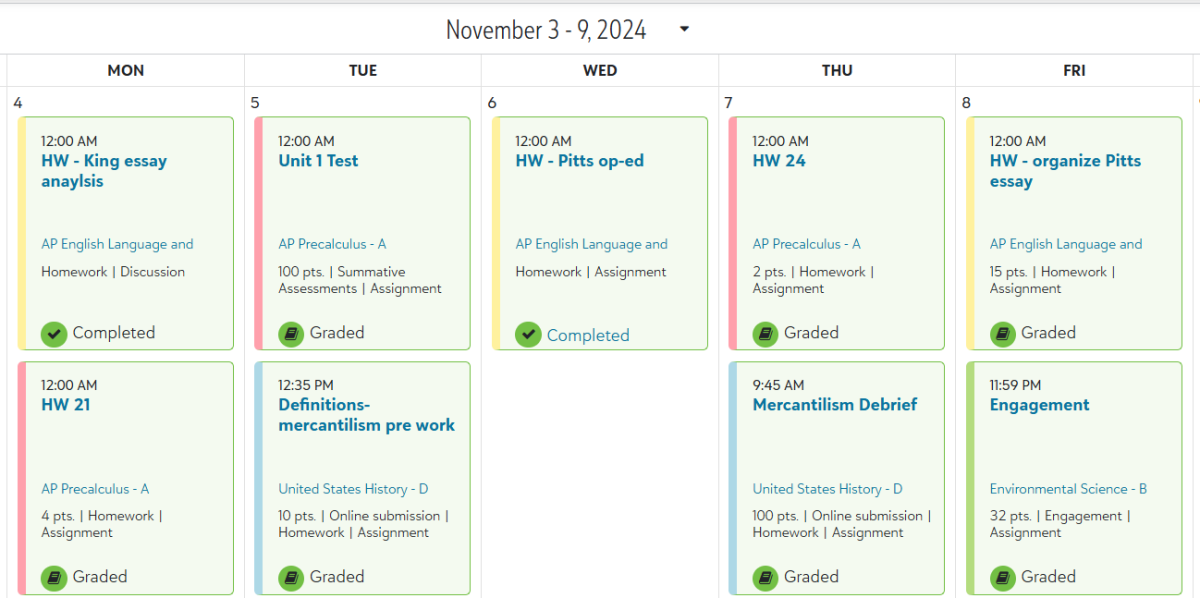
One of the many new things that were added this year was the assignment center. It is not new perhaps, but it was reworked for this year. The new setup makes it much more difficult to productively complete assignments, and it looks terrible on the phone.
As someone who often checks the portal on the phone to double-check on future assignments, I can see no details about the assignments on the portal. The screen is condensed and when you click on assignments, it takes you to the class page instead of the assignment. This is infinitely frustrating for many students who want to view and complete their assignments on the portal.
“Navigating around the assignment center is more confusing” (3-year Senior).
It is indeed confusing when you are missing assignments and you are unable to view the assignments by clicking on them. The new assignment center is color-coded yet the colors of the classes are only visible in a thin bar on the side of the assignment. The only real benefit of this version of the assignment center would be the calendar view. It is more organized, but in return, every other view of the center is completely horrendous. This is an example of things on the portal being fixed that were not originally problems. I had never heard any complaints about the old assignment center and yet it was reworked anyway.
“I don’t like that the font is bigger for the assignment, and also how if the due date passes the assignment is marked as complete even if I didn’t do it” (4-year Senior).
This is also a flaw in the system: it will make all assignments complete after the due date has passed and you can only tell what assignments you are missing by looking at the bar view as opposed to the calendar.
The school should consider these things and revert to the old assignment center. This will allow students, who are used to the old setup, to get back on track with their assignments and provide a more organized portal for all students. If it is necessary to keep any parts of the new assignment center, the school could choose to keep the new calendar view the same because it is quite well formatted and overall efficient at what it aims to do. These changes are important to the school for helping students stay on top of their assignments and not fall behind.


Ben Miller • Nov 20, 2024 at 9:05 am
The new assignment center is not as intuitive as the old one. However, this is a change that the school did not implement and is decided by the software we use for course management. We can let the company know that we are unhappy with the new UI, but that is likely to fall on deaf ears if there are other bigger customers who are happy with it.
Would you like to see a switch to a new Learning Management System? What are features you’d like to see in software like this?
Kristina Tran • Nov 20, 2024 at 12:22 pm
I would much rather have us switch to a new system because these issues with the assignment center are not the only issues we have had with BlackBaud these past few years. With a new system, we would have more flexibility. In terms of features, I have no current suggestions, but there is freedom there depending on what the school would like to accomplish.
Summit • Nov 21, 2024 at 1:09 pm
Although the assignment center update might not be the best, I think that the transition to a new system will cause more issues than learning about the new assignment center.